
Josh and Ian started Sublime in a tiny closet of an office where they built the product, raised seed funds, and almost succumbed to CO₂ poisoning. They also paid 99designs for a logo so they could focus on the important parts of launching a startup. They survived (thanks to an open door), the platform launched, and the logo did its job.
That was a different time. Our platform has grown, our customer-base has grown, and now it’s time for our brand to reflect that growth.
A new era
For years, we focused on building something incredible from the inside; the product, the team, the mission. We kept our heads down and did the work.
The work paid off. People are talking about us; customers, prospects, the industry. From a dream in a closet to showing up everywhere. From conference stages to board presentations to enterprise procurement to our mom’s fridge.
We've been wanting this moment. Now it's here. Time to show up nicely dressed.
A new brand
We know how this sounds. Customers care about whether we stop attacks, not what color our letterhead is.
But we care how they feel when interacting with Sublime at every touchpoint. Our customers love our product. We want them to love and champion our brand too.
Our creative team has been working hard to build a visual infrastructure that reflects the Sublime of today. It improves our ability to communicate with more clarity and authenticity.
A new logo
A new logo isn't vanity, it's utility. Our logo shows up everywhere before anyone sees our full brand; at conferences, on swag, in slide decks, in procurement portals. Every one of those moments is a chance to be memorable or forgettable. To be distinct or generic. Represent us or not us.
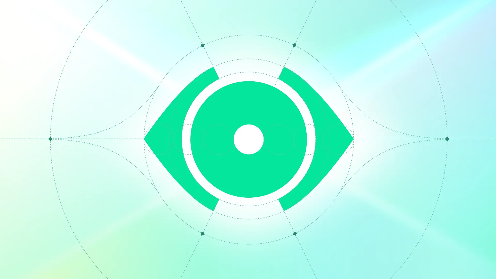
When we looked at our old logo, the silhouette and metaphor still made sense. We wanted to build additional equity around that familiar form. The eye represents what we believe is missing in email security: visibility, transparency, control. The core of what we want to achieve. The new logo expands on that legacy.
But now it can do more. The mark can morph and adapt. It stands out and it’s more memorable. It can also represent different parts of our platform. It can flex to communicate many things at any scale.
The watchful eye is our legacy. The system is our evolution.
Core principles: Technical, Optimistic, Trusted
Our customers are the beating heart of the machines we’re building. We created a framework that embodies their values and our vision of the future.
As we show up in more places, we have three guiding principles to keep us honest and consistent.
Technical
Precise, rigorous, methodical. But never cold or impersonal.
Our customers are highly technical superheroes working behind the scenes. We don't waste their time. We show our work. We explain the why. We make sophisticated technology approachable because they deserve to understand what's protecting them. We're at the forefront of email security technology, but we don't hide behind AI buzzwords or abstract claims.
Optimistic
Approachable, friendly, spirited, bold. But never silly or superficial.
We believe in empowering security teams, not scaring people into buying security. The vibrancy of our green, the negative space in our layouts, the energy in how we show up. All of it communicates a different approach to security. Confidence, not FUD (Fear, Uncertainty or Doubt).
Trusted
Enterprise, secure, durable, mature, authoritative. But never boring or stagnant.
We're not a tiny startup anymore. We serve Fortune 500 companies. We've built an enterprise-grade platform and earned trust through hard work and measurable results. Our brand needs to communicate that professionalism and depth to our customers without becoming soulless corporate speak.
What the rebrand enables
Every time you use the product, visit the website, read a blog post, see us at a conference, or talk to our team, there needs to be a consistent experience. You feel the mission. You feel the care we put into every detail. The joy, the rigor, the intention. That's what this rebrand enables. Not just visual consistency, but emotional clarity. A feeling that says: these people care about craft, about their customers, about getting this right.
What now
This is a celebration, not a victory lap. Our ambitions far exceed the limitations of today. The brand will keep evolving as we grow, as we learn, as we invest resources, and as we show up in places we haven't imagined yet.
For our customers: this rebrand reflects how we approach everything; with intention, with rigor, with a commitment to doing things right even when they're hard. If you recognize that in how we build our products, you'll see it in how we’re building our brand.
For future teammates: this is how we think. We don't leave things to chance. We don't settle for "good enough." We care about craft at every level. We’re never done improving. If that resonates with you, we'd love to work together.
The $99 logo got us here. This one will take us further.
Welcome to a new era of Sublime.
Get the latest
Sublime releases, detections, blogs, events, and more directly to your inbox.
.svg)
.avif)
